29 Mar 2013

THE POWER OF FRETWORK

Fretwork is one of the most interesting ways to add pattern to an interior.  An elegant geometric design will add depth the the rooms, and can be easily transferred into any scheme through fabrics, mirrors or furniture.  Below are a number of designs for you to abstract inspiration from.


Reflective Fretwork

A firm favourite, fretwork over an antique mirror.  This design is sumptuous as well as practical, providing a room divider between the bedroom and en-suite bathroom.  This technique will also look fabulous in alcoves either side of a fireplace.


View Relief

Create a stunning stained glass window effect by using frosted glass framed in fretwork.  The design works as a statement feature but can also be used to hide unsightly views.  Small intricate patterns are ideal for this technique as the light behind highlights every detail.


Open Weave

This design allows the natural light from the french windows to filter into the room behind.  Using fretwork to create an open plan feel is a great way to make a house more sociable without losing practical wall space.  Using a "loose knit' design and applying the wall paint will also enhance the connection between rooms.


Purely Decorative

There is nothing wrong with focusing on the decorative.  Although we have seen the practical uses that fretwork can have, lets not forget the beauty of the design.  The simple layout of the furniture below means that all eyes are on the ceiling.  The detailing draws to a natural centre where a simple elegant light is hung to complete the design.


Beauty is Wonder

This room is stunning, with elegant features as far as the eye can see.  Dragging your eye from the gorgeous paisley ceiling, the alcove contains an elegant piece of fretwork design applied to a sideboard.  With a mirrored background, that works effortlessly with the antique gold wood colouring and a subtle a symmetrical arrangement, beautiful is the only way to describe this.


Repetitive Fretwork

Here the designer has had bespoke fretwork shutters made, with contrasting fretwork designs below.  This gives the space a very ornamental ambience with a hint of oriental.  A plain white backdrop allows the pattern to dominate the space.


Bring It To The Table

Subtlety is an art that should not be overlooked.  Complete your dining table with these fretwork designs to allow pattern to flow throughout the room.  Tie in with other elements of fretwork such as curtains or furniture.


Outdoor Focus

With natural elements defining the space, the garden can be a busy area of design.  Inject your design flair with key pieces such as this beautifully crafted coffee table.  Loud colour works in a open space so don't be afraid to be bold!

For more inspiration, visit my Fretwork board on Pinterest.

21 Mar 2013

SCHEMING WITH ZEBRAS

Animal print.  I think it's safe to say you either love it or hate it.  All things considered it can be a danger zone if not carefully implimented.  Here I have taken a few of what I would call more subtle and tasteful uses of animal print.  I am currently favouring the zebra, as the black and white provides a more   sophisticated aura, that's not to say I won't be throwing in a bit of Leopard in a few months time.


If The Print Fits...

Allow the print to work with the colours in your space.  If you're opting for black and white, then the zebra print is the perfect way to liven the scheme; remember to have fun in your design world!  The use of the print at each end of the table disperses the print, while keeping it to these two key pieces makes it more distinctive.


Creative Mix

Using colour is one of the easiest ways to create contrast within your home, but why not try being brave and contrast animal print.  Introducing leopard print alongside zebra print cushions only works because the photograph is in black and white.  This keeps the scheme sophisticated and avoids it looking like a safari park.  Contrasting prints should be carefully considered before being implemented.


Print As Pattern

As a small scale pattern against blocks of colour, the print adds detail and elegance to this hallway.  A stool below a console table adds luxury and glamour, so why not make it your statement piece?


Take it More Literally

If you're still unsure about the use of zebra print in your scheme, why not take it more literally.  Black and white photography can add just as much drama and impact to white walls.  Tie it in subtly with a few black accessories such as books or lamp shades.

For more ideas, visit my Scheming with Zebras board on Pinterest

15 Mar 2013

DRESSING YOUR CONSOLE

When it comes to accessorising, placement and balance is key when dressing shelves, mantles and consoles.  They are all features that attract attention, and so should be carefully considered.  Having developed a love for console tables, I have collected a few images over time of designs that have inspired me.


Accessory Showcase

Choosing a console the same colour as the walls creates a showcase for the items and accessories used. This means that choosing the items carefully is key.  Here the designer has based the colour palette on the large framed print in the background.  Soft corals and blues create beautiful contrast the the stark black background.  Colour coordinated books are an excellent way to add blocks of your chosen colour.


Height for Width

Consoles naturally occupy a lower, horizontal space along the wall.  this means that in a high ceilinged property, upper wall space can look bare and empty.  Make sure you accessorise appropriately to the scale of your room.  A tall mirror and artwork arranged in column format compliments the space.  On the console, taller accesories work well, the candle stick and plan stand reaching up into the space, while below, the two stools create an extension down to the floor.


Console Extension

An obvious arrangement when it comes to lighting the console table is to use a table lamp at either end.  This design is eye catching beacuse the lamps stand proud of the console.  The design area is extended, and allows for more pattern and shape to be added to the table.  When taking this approach, it is important that the lamps tie in with the console.  Here the designer has chosen gold bases and black bands around the shades to match the colour and detailing on the console.


Connect the Space

If your console is to be placed behind an item of furniture or at the back of the room, make sure your accessories relate the the rest of the room.  Using the same bold orange in the foreground and the background draws our attention to the console table and the interesting accessories that have been used here.


Proportional Width

If you have a long wall space, then a double length console table is the perfect solution.  When accessorising, make sure you are using a small number of larger items, rather than lots of little accessories to fill the space.  Over accessorising will look over-cluttered and chaotic.  Smart black and white prints in identical frames work well with the minimalistic approach.  Theming the accessories will create harmony and balance in your room, using complimentary colours, textures and images.


Compact Simplicity

Drawing attention to three main features works particularly well here.  The elaborate console table and close-up photograph behind it is uncluttered, with just two simple lamps.  The grey colour palette is lifted with the use of the gold lamp bases, but due to the intricacy of the console base and the intensity of the photograph, the colour does not detract.  There is a sense of claustrophobia created, but due to the scale of the pieces, this adds interest.


Colour Transfer

Here the designer has used the colour palette to tie the two rooms together.  Sophisticatedly moving the user from one space to the next creates harmony between rooms.  Anyone intending to use this technique should ensure that each room can hold it's own and does not blend too seamlessly with the one before.  Remember to create interest in each space.  An unusual photograph allows this arrangement to attract the viewer.


For more ideas visit my Console Table board on Pinterest.

2 Feb 2013

CHAIRS - BACK TO FRONT

Gone are the days when furniture lined the walls and didn't enter into the room.  Nowadays we place console tables behind sofas, place lamp tables in the middle of the room with sneaky plug sockets in the floor and allow furniture to become a central focus in the room.  This recent change means that more and more designers are taking an interest in the back of furniture as well as the front.  


The Lace Back

One of the most innovative designs I have seen, taking inspiration form the the corset, this chair gives the impression of being open to the viewer.  The gold back blends with the curtains and fireplace to create an encapsulated appearance.


Patterned Dining

Looking at a chair that always has it's back on show, the dining chair is perhaps the most important to consider when planning the interior.  The fabric used on the backs of these chairs connects the black frame to the white base and adds pattern and focus.


Victoria Ghost

A delicate take on the Victoria Ghost Chair designed by Phillip Starck.  This chair is beautiful from the front and the back.


Simplistic Contrast

Although the back of the chair is plain and simple, this creates a contrast to the front which boasts strong colour and deep buttoning detail.  The colour is contained within the dining area, while the back matches the monochromatic surroundings. 


Ikat Black

In this design, all colour and pattern radiates from the back of the chairs out, into the room.  The bold organic pattern contrasts to the regimented repetition to create a stunning feature.  

31 Jan 2013

BLACK, THE NEW WHITE

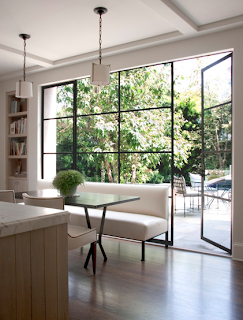
Recently I've seen a lot of interiors moving away from the conventional white window frames, and embracing the new style black frames.  The style appears to work particularly well on thinner frames and adds contrast against a bright white wall space.


Delicate Framework 

Elegance and drama in this gorgeous, sunny living room.  The back wall would be lost without the black framed doors opening out onto a green garden.


Bathroom Doors

Here, the black framed french windows compliment the simple mirrored layout.  Using subtle tones of black in the floor and furniture completes the scheme.


Roman Arch

Using black to emphasise the architecture in this kitchen is an effective way of adding interest and height.  Black iron handles draw the windows into the rest of the scheme.


Black to Natural

The use of iron window frames works well with a scheme boasting natural materials.  The natural linen blinds allow light to travel through and create a bold silhouette.


Crisp Black Lines

Use black frames to create a smart interior, tying in with black framed furniture and other outlines throughout the room.  Notice the designers choice of lights which also bear iron frames.

For more ideas, visit my Black, the new white board on pinterest

24 Jan 2013

TEXTURED BEDDING

White, ivory and neutral bedlinen creates a soft and luxurious effect in the bedroom.  It can be adapted to suit most schemes, but can become a flat and uninteresting part of the room.  Using textured linens with high and low relief will revive this part of the room.


Diamonds are Forever

When using white, it is important not to create a clinical atmosphere.  Bright white bedding with a diamond pinch pleat texture creates soft grey undertones that warm up the tone.  The combination of texture and plain sheets adds to the layering effect.


Softly, Softly

The subtle stitching in this ivory throw creates a soft relief effect.  These beautiful textures compliment the romantic colour palette used throughout the room.


Petals and Swags

Vases of soft roses emphasise the use of petals on this bed throw connecting the elements within the room.  Sweeping swags and a silk bed curtain work seamlessly together to create an overall focus.


Total Texture

Make a statement with top to toe texture.  Use a simple bed frame to allow the effect to take presence within  your room. 


Bedroom Frills

This fabric is being used ore and more, for extravagant window dressing, shower curtains, and now as a bed cover.  The spill effect, works perfectly with the contours of the bed, adding real depth and tonal contrast.


The Bigger the Better

Another diamond texture but this time on a larger scale.  The use of larger shapes creates a more sophisticated and orderly texture, perfect for this, more formal bedroom.

For more, visit my Textured Bedding board on Pinterest

22 Jan 2013

THREE SO FAR...

When it comes to bathrooms, it takes a lot to impress me.  On my search for inspiration, I have so far found three that really caught my eye!


Grey Matter

The smart inset sink and taps create an organised and sophisticated arrangement.  Accents such as fresh flowers and candles add luxury and style, while the silver  leaf mirror projects glamour.


Bathroom Angles

Although this design is very angular with bold outlined frames and brick tiles, there is something pleasant and chic about this design.  Again the use of fresh flowers is a must as it subtly enhances the freshness of the room.


Bathroom Bubbly

The perfect colour combination of silver with champagne pink creates instant luxury and indulgence.  The marble top with free standing bowl adds texture an shape to the arrangement.

If I find anymore, you will find them on my Bathroom board on Pinterest