14 Jan 2013

COLOUR COMBINATIONS II

BLUE AND ... BLACK


Unpredictable Beauty

When it comes to design inspiration, the unexpected is the best.  It lets you explore new ideas and experiment with new pathways.  Baby blue and black is an unusual combination, possible due to the connotations tied to baby blue.  Ignoring the conventional and stereotyped, this image conveys the splendour of the combination.


Dark Elegance

Another rebellion against convention is this black and navy scheme.  A bright enough navy will stand out against the black and create grandeur and supremacy.  Although the colours are set against a white backdrop, the rich wooden floor lifts warmth into the decor.


BLUE AND ... CORAL


Pastel Reef

Teaming blue with coral reds creates a serene and peaceful setting for light conversation and relaxing evening parties.  Warm tones will relax your guests, while a deep blue conveys richness and a touch of subdued grandeur.

12 Jan 2013

CHAIRS - BACK TO FRONT

Make a design statement from every angle of the room by using contrasting fabrics on the front and back of your chairs.  You can mix pattern or colour, scale or style to create stunning chairs that are central to your design.  For the less experienced, fabric books will often offer patterned fabrics with complimentary plains, allowing you to select fabrics chosen by experts to work together.


Ikat Style

Ikat is making its comeback with surface designers such as Turnel and Gigon, Mulberry and Kravat all featuring it in their collections.  To re-create these stunning dining chairs, go for large prints that won't repeat too many times.  Taking the darkest colour from the Ikat palette, this designer has chosen a black velvet as a striking contrast. 


Exceptional Perspex

 Although this design does not entertain a contrast of fabrics, the use of soft and hard materials creates eye-catching impact.  By using a plain neutral fabric, the delicate pattern etched into the back piece is intensified.  Effects such as these mean that chairs need not be against a wall, but out in more unusual arrangements creating a more contemporary feel.

10 Jan 2013

COLOUR COMBINATIONS I

PINK AND ... YELLOW


Moroccan Brights

This daring scheme is off set by a calm grey backdrop allowing the vibrant accessories to dominate the design.  So often drama is created with deep, moody tones, but with bright tones and bold shapes, this design oozes confidence.


PINK AND ... GREY


Soft Warmth

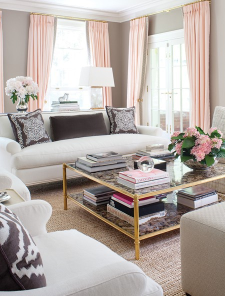
A palett of soft grey, baby pink and rich gold creates perfect tranquility in this drawing room scheme.  The warm colour has been introduced subtly through fresh flowers and books, and more substantially through the curtains.  Consider the balance when inputting clour against a backdrop and ensure it is evenly spread for a completed look.


Winter Blush

During the winter months, you may wish to opt for a cosier colour palette.  With changeble accesories, the grey and pink scheme is adaptable to the English extremities and can look inviting after a long autumnal walk.  Cushions, vases and rugs are all accents that can be changed to make a big difference to your space.


PINK AND ... BLUE


Baby Hues

Mix baby blues and pinks with a bold black and white scheme to create a contemporary Moroccan scheme.  Introducing colours through artwork and pattern has created a balance in this set with the pinks assuming horizontal symmetry while the blues assume vertical symmetry. 

4 Jan 2013

ALCOVE TREATMENT

There just isn't enough inspiration when it comes to alcoves.  They are a small space that can make a big difference in a room and although they might seem a rather traditional concept, there should be no cliché constraints when it comes to the design.  So in this post, I have pulled together as many ideas as I can find to help you make a recess statement.


Contrast Darks 

Create  a fabulous fireplace by offering stunning tonal contrast between the chimney breast and the alcove.  Grey tones throughout the rest of the room is what allows this to work as a confident statement.  If you're not into monochromatic, try another vibrant colour on the chimney breast, and support this with softer tones throughout the room.


Stock Up

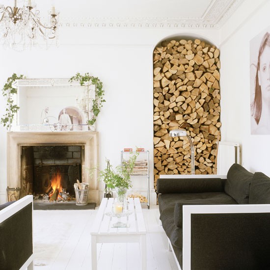
Create a natural feature by piling up logs either side of the fire place.  Not only does this create a practical storage area, it also adds warmth to a colder colour palette.  Here, the use of a chandelier and books tie in the natural wooden tones, while the use of other natural products throughout the room keep it looking fresh and informal.


Spa Beauty 

Making a feature of this alcove adds a touch of hotel chic to the design.  The key is simplicity, choosing tiles with a soft tonal range and luxurious accessories that encourage indulgence.


Back to Natural

A contemporary natural alcove creates a streamline appearance with a touch of zen.  Stark black and white colours are softened with a range of neutral tones throughout.  Enhancing the idea that nature has it's imperfections, an asymmetrical use of elements on the console table cocoons the overall design.


Disproportionate Minimalism

For more ideas visit Alcove Treatment on my Pinterest page

29 Dec 2012

OUTDOOR INTERIORS

No matter what size, the garden is an extension of the home and so is an important design consideration.  This post explores not only ideas for a singular area of the garden such as a breakfast patio or terrace, but also how the design of our interiors can have an impact on the external look of our houses.


Skyline Blue

External surroundings are often explored when designing our interiors. We look to them for inspiration.  When designing your garden, the same logic can be applied.  Don't forget your seascape, countryscape or cityscape. They are your initial point of contact, your palette, and can be used to create harmony and balance.  The powder blue seat cushions on the image above mirrors the blue sky, while the metal framework talks to the buildings, communicating in both colour and texture.


Internal Tones

Taking this image as an abstract example, the tones of the fabric, extract those from the stone on the outside of the building.  This creates harmony between the internal and external.  Curtains area prime example of how important this is, as they can often be seen from the outside,and so will affect the external appearance of your home.  Anything else placed in front of a window or in a conservatory will be on show from the garden and so should be considered from both the inside and outside perspective. 

For more ideas visit Outdoor Interiors on my Pinterest page

CONSIDER THE CEILING


The ceiling is often a design consideration that is unfairly overlooked.  Although lighting is a contributing factor to the design of your ceiling, there are many other ways to create overhead drama.   Take the time to consider what will work best in your own room, thinking about ceiling height and expanse, as well as your ideas for the overall design.    


Mirrored Lace

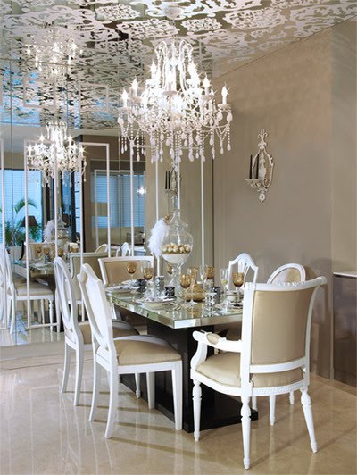
Here the designer has used mirror on the ceiling with white lace effect motif applied on top. This adds decorative detail, but also avoids unwanted reflections of the movement below.  Notice how the top two thirds of the walls are a flat colour,as is the flooring.  Simplifying the rest of the design allows the room to breathe and avoids a sense of chaos that would otherwise be created with two much pattern in the room.


Architectural Depth

This image takes architrave to new extremes, creating a stunning feature that dominates the room.  The bold shapes, emphasised by intricate layering lifts the room into the modern era but also compliments the period furniture because of its traditional design routes.  This is always something to consider when creating a successful design, research into the past, and how it might influence your designated the overall look of the space.


Ethereal Design

This is where research into interior design can take you. This designer has experimented with light and shadow to create a fantastic effect on the ceilings and the walls.  The effect is created by using a glass light shade with intricate metal detailing and a bright bulb, necessary to create strong lines. 


Circus Tent Dramatics

This one may not be everyone's cup of tea but it certainly makes a statement of the ceiling.  A tall ceiling is what allows this to work, as well as the simplicity and sparseness of the furniture.  The ceiling is a continuation of the striped walls creating the appearance of a big top found at a circus.  The high contrasting black and white adds drama to the effect, however if your not feeling so bold, consider a softer colour pallet.

For more ideas visit Consider the Ceiling on my Pinterest page.

CONTRASTING CARVERS

In an open plan space or a specified dining room, the dining table can become an ornamental feature as well as a practical piece of furniture. Making it beautiful is key to a welcoming home, with comfy inviting chairs for long evenings full of conversation and laughter.  Here I have focussed on the seating as a tool for creating a stunning centrepiece to you room.


Period Oriental

Here, not only is there a contrast of chairs, there is also a contrast of styles.  Mixing oriental side chairs with traditional English carver chairs and period features creates an eclectic mix and a unique statement.  Using yellow to draw the two styles together allows the room to work as a whole, an idea to consider if you plan on mixing styles or eras.


A Spot of Zebra

These zebra print carver chairs work fabulously within the monochromatic room set.  They team fun with an air of elegance and create pattern in what might other wise be a flat roomscape.  A fun, lighthearted touch will create a talking point and allow guests to relax much more quickly, and should be a key factor in your designers mindset. 

For more ideas, visit Contrasting Carvers on my Pinterest page